Zwarte Jan
A project in collaboration with the Amsterdam museum to create a video game in response to the exhibition "Panorama Amsterdam: a living history". With my team we made an augmented reality game that makes art really come to live!
Concept
We have chosen to play Joris Fonteyn, alias Zwarte Jan. The player is the best detective in Amsterdam and must find out for Elsje Otte what happened to her Joris. Because the player comes into contact with different paintings and receives the letters from Elsje, you gradually discover the story of Zwarte Jan.
Augmented Reality
For our concept we used augmented reality, we wanted to bring the paintings exhibited in the panorama
exhibited in the panorama to life and thus make the
player feel more involved in the game. The
paintings tell a story about Jérôme by means of interactive
the eyes and mouth, they tell a story about Joris Fonteyn and what he was
engaged in.
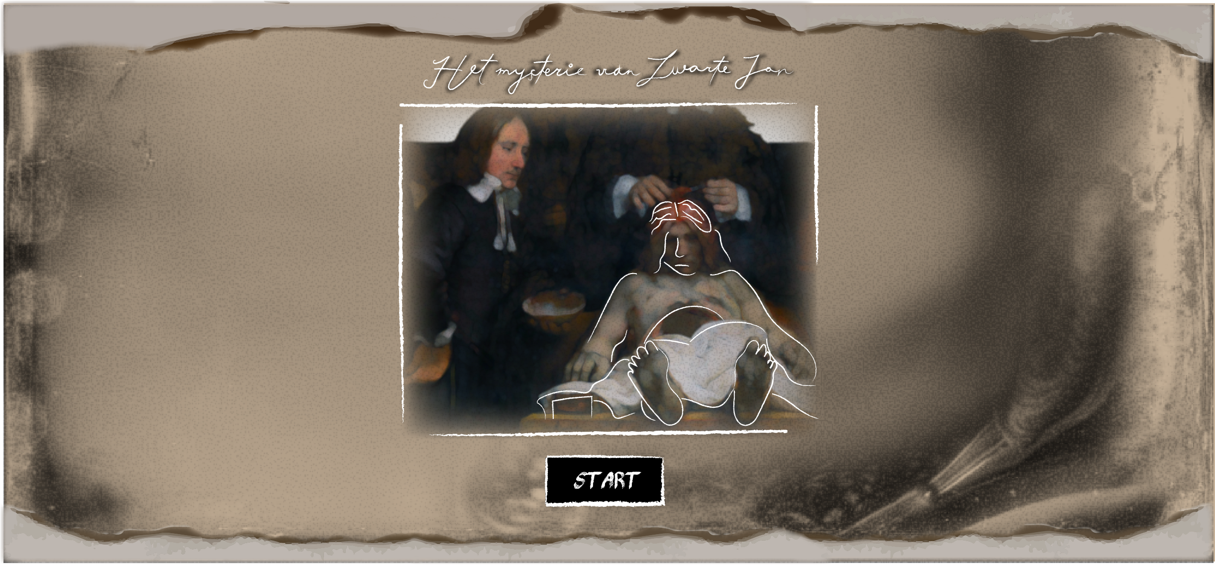
For the story, we focused on Joris Fonteyn, also
also known as Black John. This man can be found in the painting
of Dr. Jan Deijman and his anatomy class, we found this to be a
striking and sinister painting and wanted to find out more about him
find out more about him. Because he did not have much influence in
history and there is also not much to find about him, we thought
this a useful idea to choose him as our story, so we could add
we could add our own events and not have to tell fake news to the player.
tell the player.
From our research on Joris Fonteyn we have found out
that he had a love in early 1653, Elsje Otte. Because of this we could
us a good start to our game, that the player had a
reason to investigate what Joris has been up to in his life and how he
in his life and how he ended up on the sectional table of Dr. Jan Deijman.
of Dr. Jan Deijman.
My task
I was the assets curator during this project. I created the UI application of the game. With a lot of iterations on setting up the screens. And further, I thought about an appropriate style so that the look and feel would come out well.
Interface Design
As a device we have chosen to use a mobile, this is convenient because our game is played in the museum itself. The game revolves around figuring out who the man in the painting of the anatomy lesson is. To portray the tension and ignorance we found it important to use dark color tones. use dark color tones. And because the story takes place in the 17th century, drab colors like brown, beige and gray come to the fore. Texture was also an important addition to distance our corporate identity from the modern look and feel, we use grainy, tears and crinkled style. To make a choice we first started to work out the first screen, these we put it on the different possible backgrounds that were made. Crucial elements for our style are that we use titles in a flowy / concatenated font because this fits with the way of writing in the era we have chosen (17th century). Furthermore, we want to use a pencil-like lines for a minimalist and old written feel.
Usability
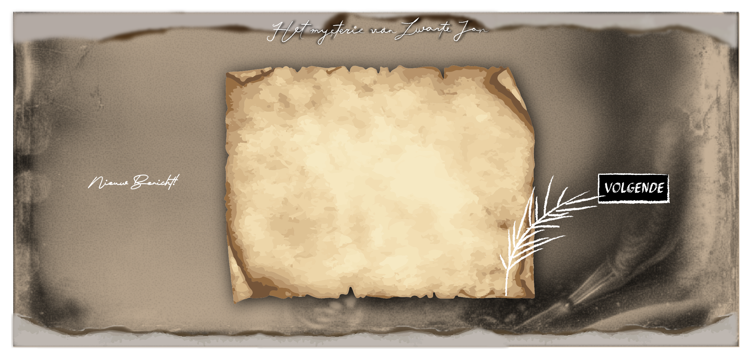
The letter screen shown above has been changed to a zoomed in version.
zoomed version, here we also removed the spring to make the text easier to read.
This is very important for the experience and convenience of the user.
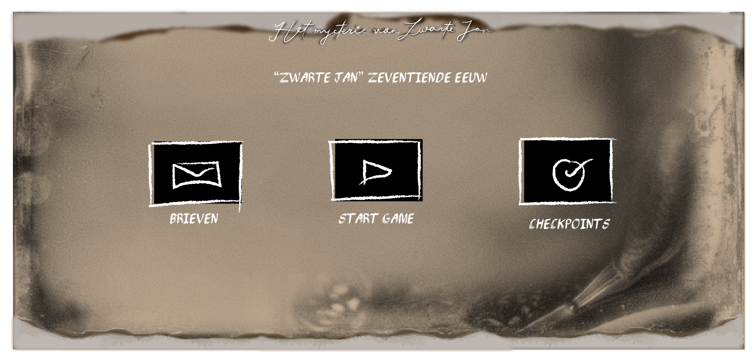
The right image above is how the first menu screen would look like if we had a separate
letters screen, we eventually took this out and merged it
and merged this with in the log. You can also see that we first had a
page of 'checkpoints' this was later changed to the logbook,
merged with the letters. We did this because there was more logic to the role of the player. A checkpoint page that only noted where you had been didn't really seem to have any added value to us.
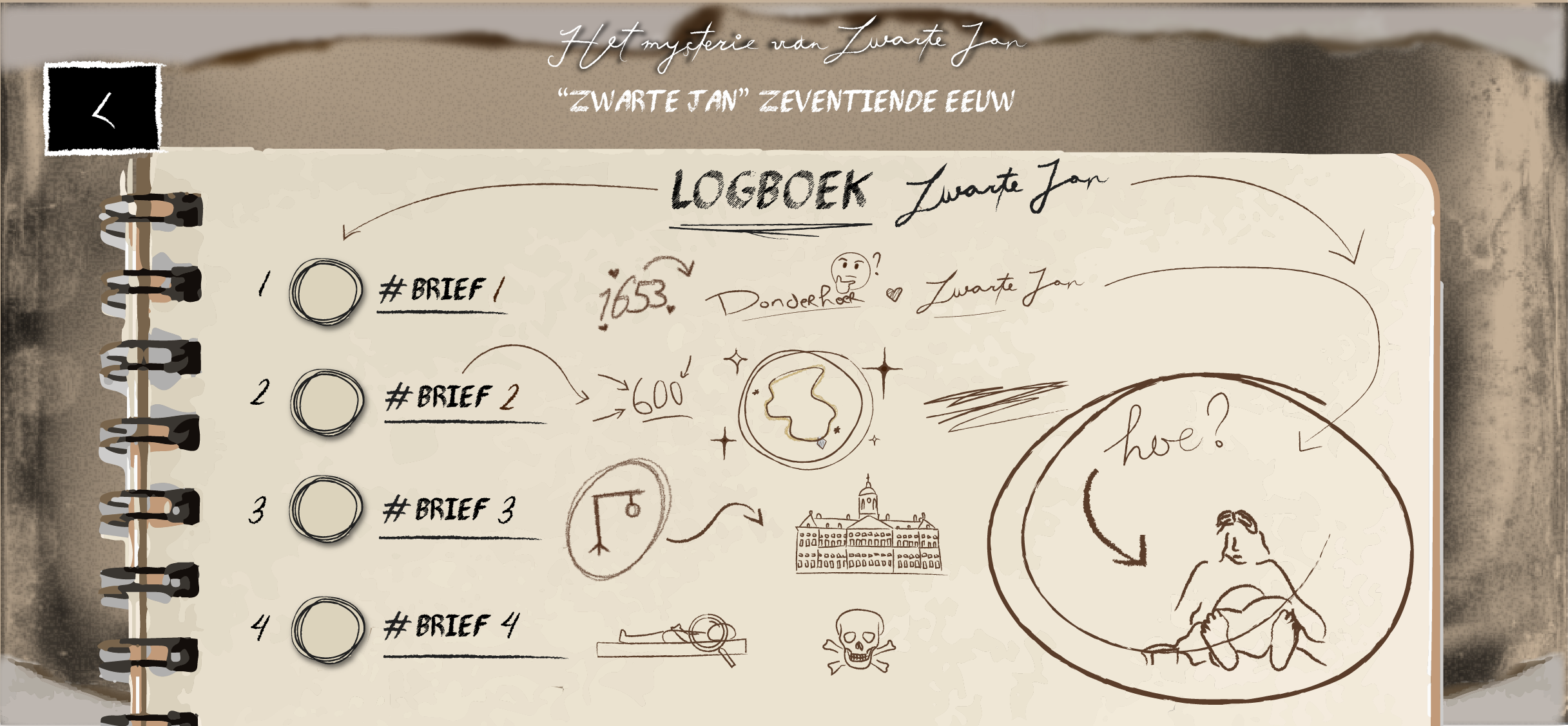
The logbook page has also had some drastic changes.
First we wanted to put all conversations and letters in there. The page was immediately
The page was immediately full and it felt very awkward because some letters then had to be locked if the
had to be locked if the player hadn't passed by them yet. Furthermore it looked more
it looked more like a list than a real notebook, so we wanted to change it.
As you can see above, we had in mind that you would get a checkmark
This idea came from the lo-fi version where we would have a page with checkmarks on it.
where we would have a page with checkpoints, so this page has been
changed to this log page.
For the final log screen, we made sure it was very
interactive. The letters are in there by default but as you can see on the first
image there are no notes. This way you as a player know when you
already received a certain letter. The notes really indicate what is described
described in each letter and with this we give character to the player who, as it were, keeps adding to these notes.
as it were, keep adding to these notes in order to get the best possible picture of what
what happened to Zwarte Jan.
Fonts
For the text of the letters, we used the font 'PencilPete'. For the titles we have used the font 'Signature December', but we have We have blurred it and did not write over it ourselves with the chalk pencil, this we found nicer than the real font and was somewhat easier to read. For the buttons and button titles we have used the font 'Pencil shading'. used. This font is easier to read than 'Signature December' hence that for text we did not choose to use a concatenated font.
Style
The image above shows what the final style became. The torn / burnt papers fits well with the painting in which Black John is This painting was also burned. For the rest we went for this beige gray color so it was not too dark but still fits the style of that period. the style of that period. The white chalkboard lines provide something extra, it also fits with the role of the detective (that is the player) who makes notes of his findings. As a detective, you often circle important findings to emphasize on something that we wanted to incorporate into our style.
Result
The study organizes a list of the best works every year this is determined by the teacher and from this comes a list of nominated works from that school year. Our game was nominated for a Golden Dot Award 2022!