Gucci Rush
In the second year of the Communication & Multimedia Design program, you had to get two SRP credits. I chose to come up with my own project and work on it. Since we never really redesigned an existing product during the study itself, I found it a fun challenge.
Assignment
Redesigning the packaging of a product. I want to do this with a product that I feel is not my taste or could be better. I want to do this by doing research on the brand and bring that to life along with my idea in a new design. Which represents both the product and the brand well.
Product
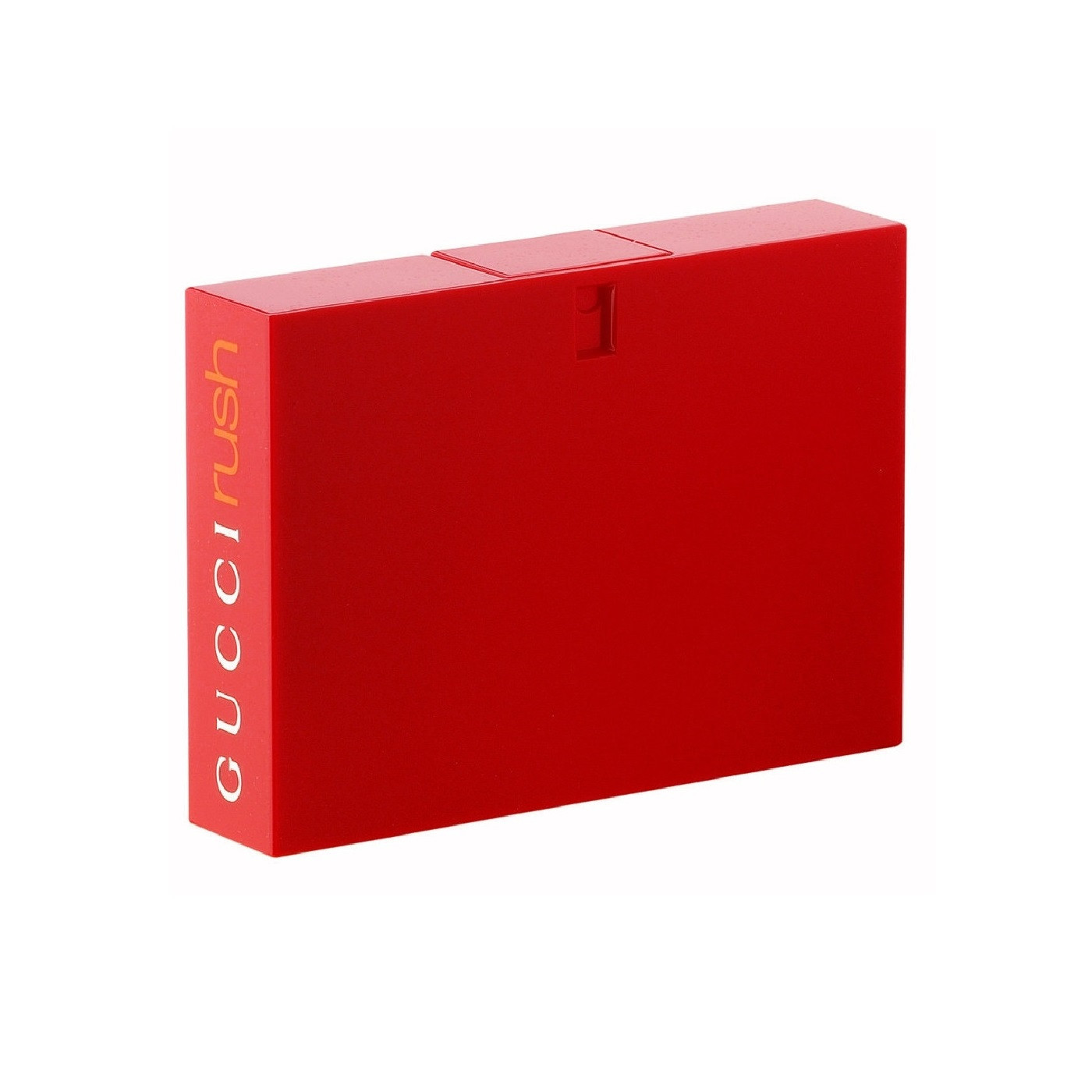
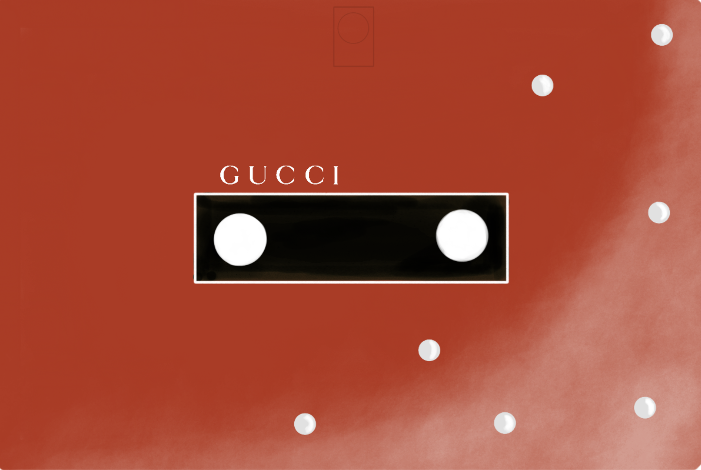
The product I redesigned is the Gucci Rush perfume. The original packaging of the perfume is a red square that Gucci says should resemble a cassette player. The shape of the perfume is certainly unique, but without reading that description I wouldn't know this. The red color is beautiful but feels very simple and easy. The perfume bottle doesn't steal the show and doesn't show what it really stands for. It simply looks like a red square. So this is where I want to change things up a bit more!
Design versions & iterations
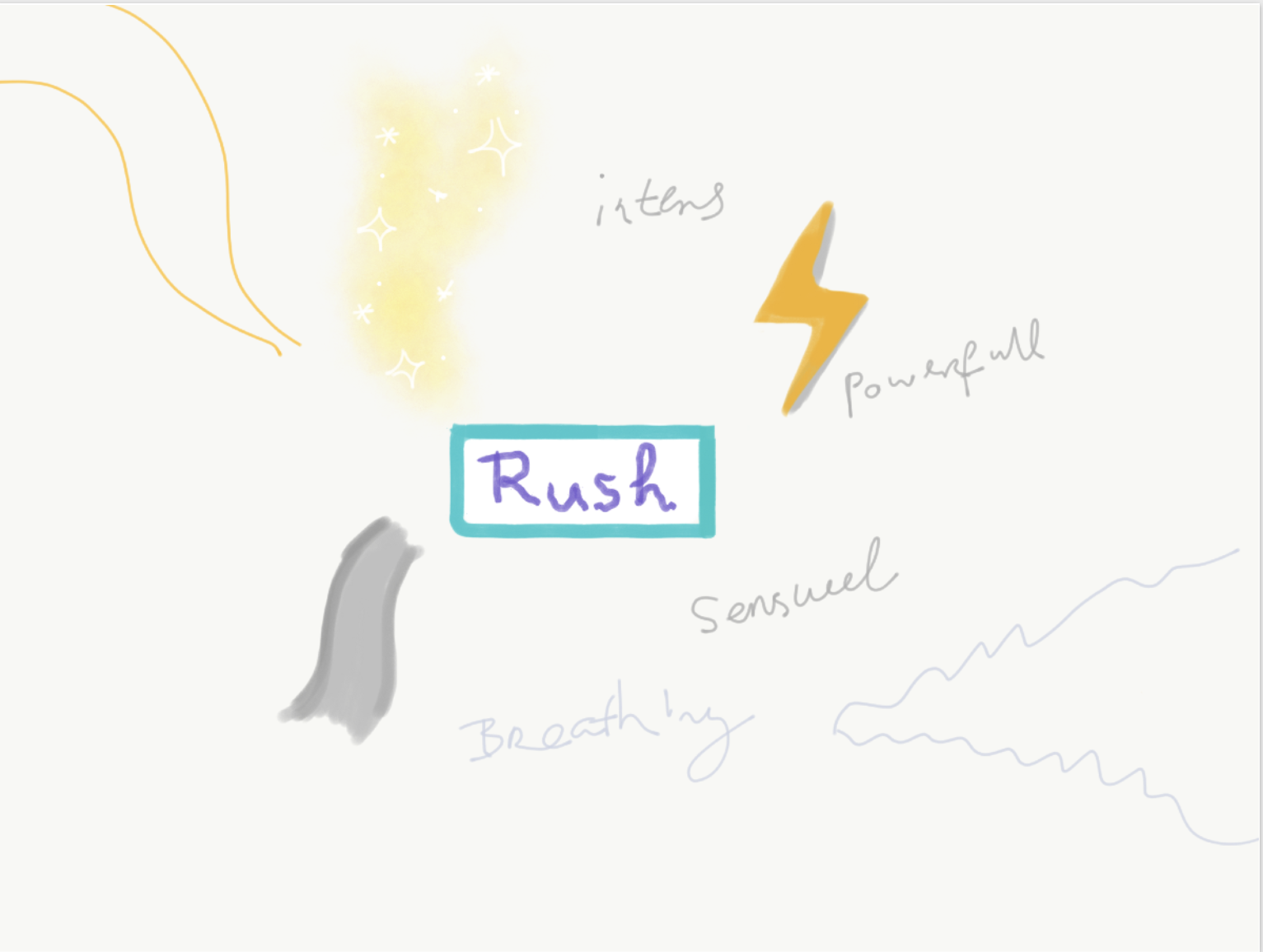
I was trying to portray how I could make the word "Rush" portray and combine it into a mind map with words that explain the word Rush for me.
Version 1
I personally see perfume bottles as a decor piece too, since the Gucci rush already has a unique perfume bottle, I thought it was time to make a statement with it too. make a statement with it too. The white balls are supposed to represent pearls and the center piece should represent the videocassette tape look. I chose pearls to give the bottle a bit more of a luxurious look that customers are used to and to give it a bit more of a personality. what customers are used to and tried with the white glow the white glow to portray the sensual "rush". But found the design not quite appealing to me.
Version 2
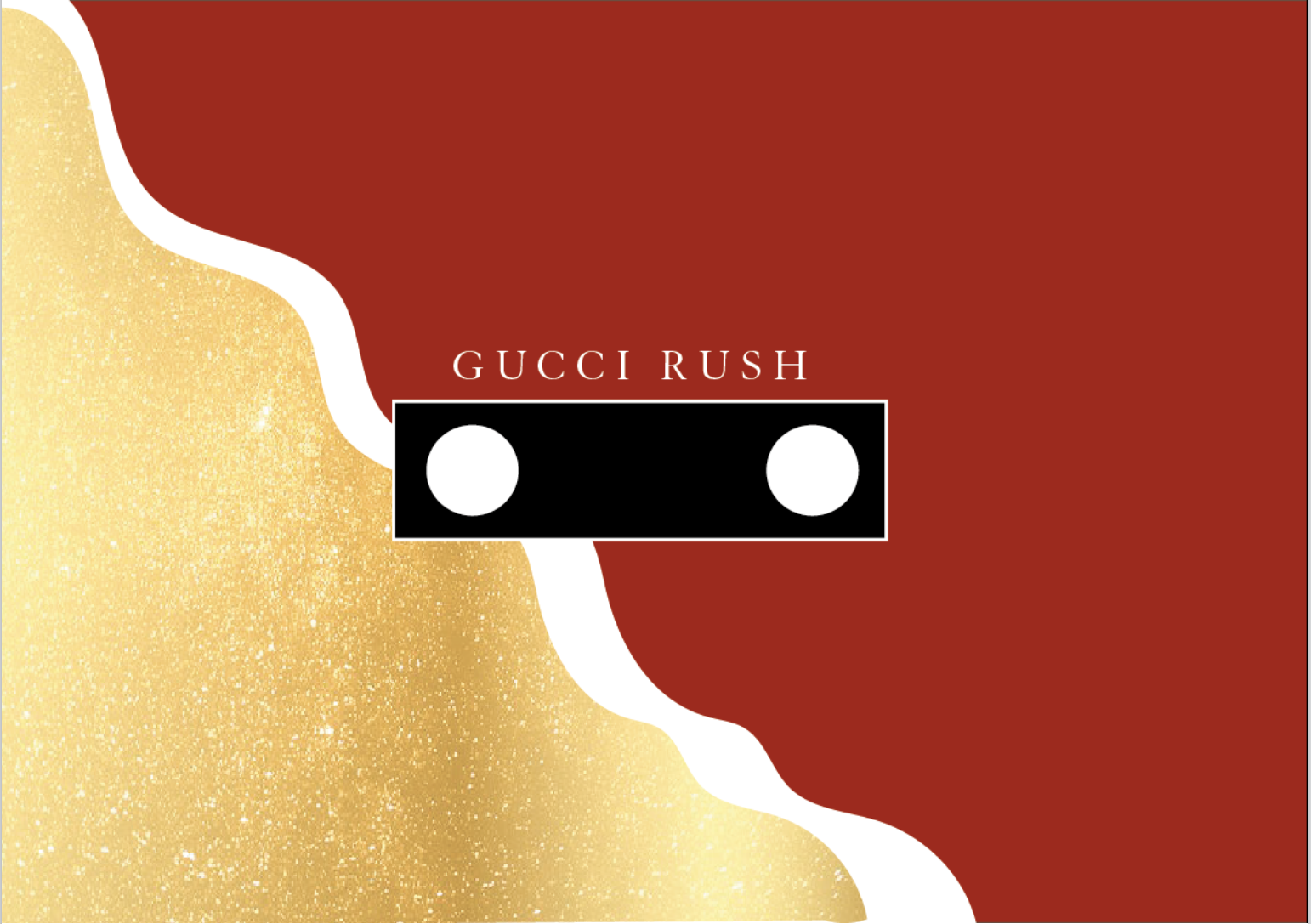
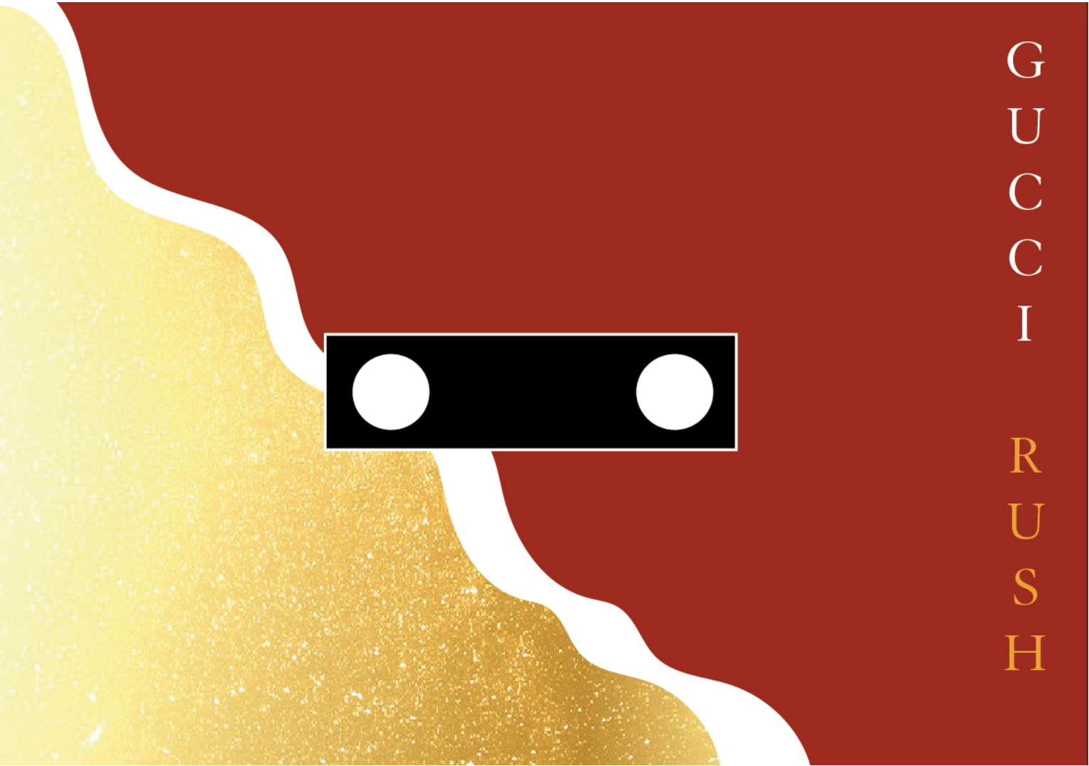
The second version I did completely differently. I used the flowy line to represent the sensual rush. Further this fragrance has a feminine target audience, so the gold surface again portrays luxury (no real gold) and reminds a bit of the color of jewelry.
Version 3
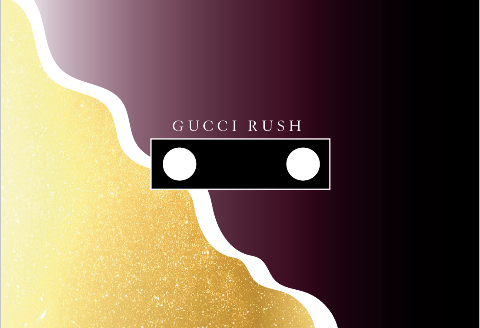
Then I made a third version, with a purple glow as the main color. I thought version 2 was already good but it felt like
it was still too basic. For me, the purple color described what Gucci Rush fragrance reminds me of: the mysterious and
sensual of love at first sight. Purple still has a little more of that feeling than the red color.
"Gucci Rush is a very attractive and recognizable fragrance, impulsive and irresistible, just like love at first sight."
- Fruugo
Surely red is a little more familiar and beloved than irresistible and impulsive, but it could be all if you
interpreted differently.
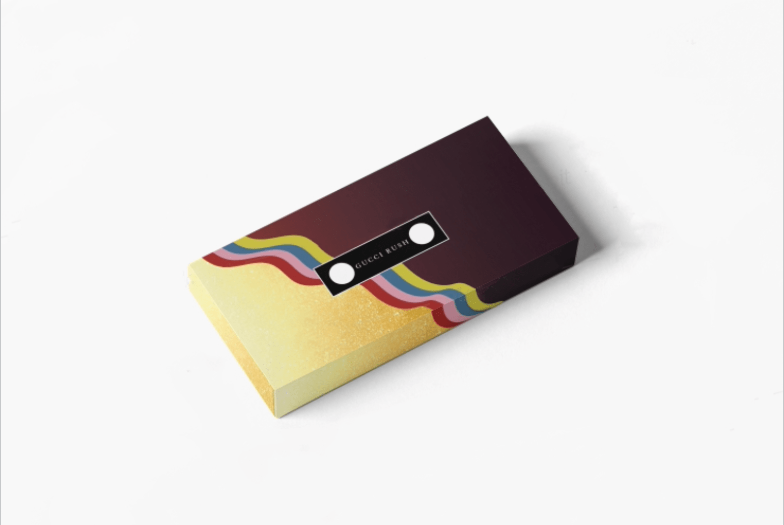
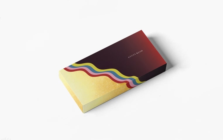
Result
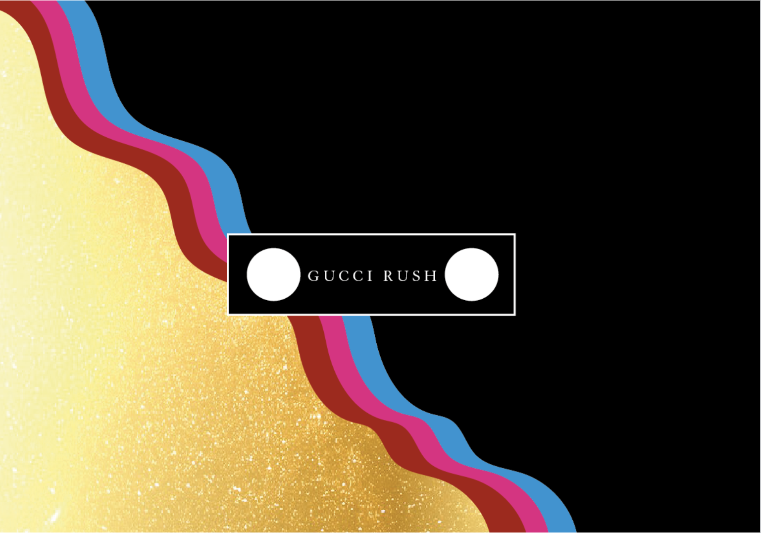
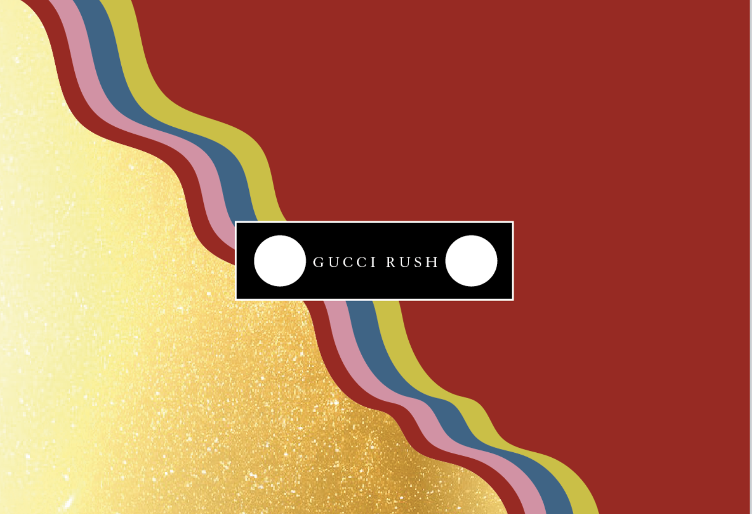
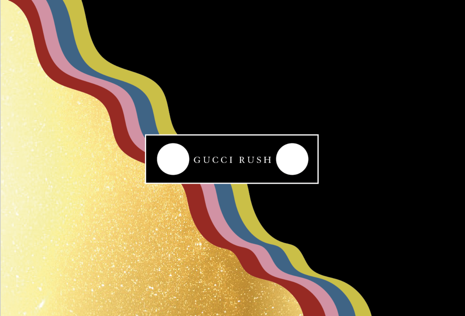
Since I didn't know whether to go for version 3 or 5 anyway, I in the final design I have chosen to mix the original red color with the purple expanding slightly into the black. The green, blue, pink and red were inspired by the 1999 Gucci summer collection but also the iconic red and green lines (see image below) making it fit within their style. The colors are not bright like version 4, making it look somewhat mature look. I think the perfume now really carries a 90's statement with it and it has become an eye-catching item instead of the boring red design. boring red design.